My inspiration for my final font choice has come from several different rock bands, past and present. First of all, The Strokes, whose song we are preforming, have really good font that depicts the genre easily. I feel the colours work well together, as it enables the band's name to stand out. The font itself, has connotations of a retro, indie band; this is something I wouldn't mind emulating.
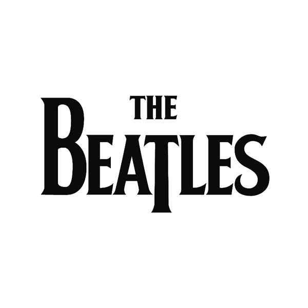
The Beatles' font is also inspirational. It is all in caps, which makes it stand out and also helps to convey the genre. The use of colour also contributes to the effect of the font. The traditional black and white, allows for the text to stand out. There is also a clear retro feel to this font.
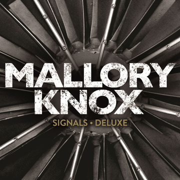
Mallory Knox's font conveys a different sort of rock. The band are more heavy metal compared to The Strokes or The Beatles, thus this has had an effect on their font. I like the way that their are cracks in the font, which helps to distinguish the genre. The colours are dark, contrasting that of pop, also conveying the genre. The caps help the text to stand out, and is something I am interested in.
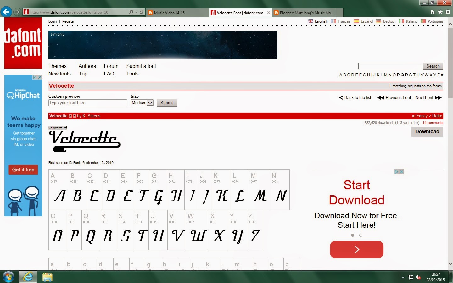
I looked on DaFont and found these three fonts that I liked.
The first is more of a garage look, whilst the other two are more of a retro style. Texts one and two are not in caps, unlike the top one. I think I would like to keep searching for one that combines the two.

.jpeg)