Showing posts with label Research. Show all posts

Wednesday, 11 March 2015

Initial idea - Website

I would like to have a home page like Catfish and the bottlemen, as I feel it conveys the genre and also follows the conventions of a website; having easy navigation and links to social media.

However, I may use the album cover as my background, instead of an image of the band. But I will attempt to keep the same layout, as Catfish and the bottlemen. I propose to have links to: upcoming tour dates, album purchases, news and social media links all on my home page. There will, however be separate links to tour dates, album purchases and new, through an easy to use navigation bar at the top of the screen. I will also have a merchandise store like Mallory Knox's, as I feel the band will offer similar products.
I like the idea of the lyrics page, featured on Catfish and the bottlemen's website. I think this would be a good page for fans, and makes the band stand out from the crowd as it is not a convention of a artist's/band's website.
I believe I will need a video and photo page like all the others I have researched, as I see it as a convention. It is also very useful for fans, as they like extra content to entertain them. I will use similar font to that of the Strokes, yet most band's use the font from their most recent album. Though this isn't the case with the Strokes or Arctic Monkeys, were they have almost created a universally renowned logo.
I will also promote the new album on most pages of the website, where it is suitable though. I will create facebook, twitter, YouTube and instagram accounts, as all of the bands I have researched have these.


Website analysis - catfish and the bottlemen

Catfish and the bottlemen's website differs from all the others I have researched. The home page, features the album at the centre of the page, and if you hover over it, all the song titles show up. The website background matches the black background of the album cover. Their biggest upcoming gig dates, feature at the top of the page. Whilst, there are also links to purchase any tickets for spring 2015 gigs and links to purchase their debut album. Unlike all the other websites though, it features a 'Enter Site' button. The reason there is so much information on the home page, is so that if anyone came to research the band, all the information they might be sourcing is all available without entering the site.
The home page to the main website is typical of the indie/garage rock genre. A picture of the whole band dominates the page. The photo is in black and white, as to convey their traditional persona, yet also the colours of the album. It is something I would like to emulate. There is an easy to follow navigation bar, with the option to by their debut album on iTunes at the bottom of the screen. There are also links to their facebook, twitter, YouTube and instgram pages.
Their 'shows' page has all the band's upcoming gigs for the whole year; there is a link to buy tickets from the website, which takes you to a another band page which changes language depending on where the venue is. Once on this page, the venue, the time and the price are all available. The video page has all the most popular songs and their music videos available to watch. There are also band videos from behind the scenes of their gigs. Unlike all the other websites I have researched, there is a link to the lyrics from their most popular songs. The lyrics are hand-written, suggesting that these are the lyric sheets the band used. This could be something to emulate.
There are links to the band's new releases and photos of the band. Unlike the other websites, there is a link to a tour diary that features all what the band have been doing on tour. Also there a contact page, so fans can the band to perform live at a venue, or contact their management for press opportunities. This separates them from all the other band's websites I have researched, as it seems they want to be more personal with their fans. I would like to emulate this.

Website analysis - Arctic Monkeys

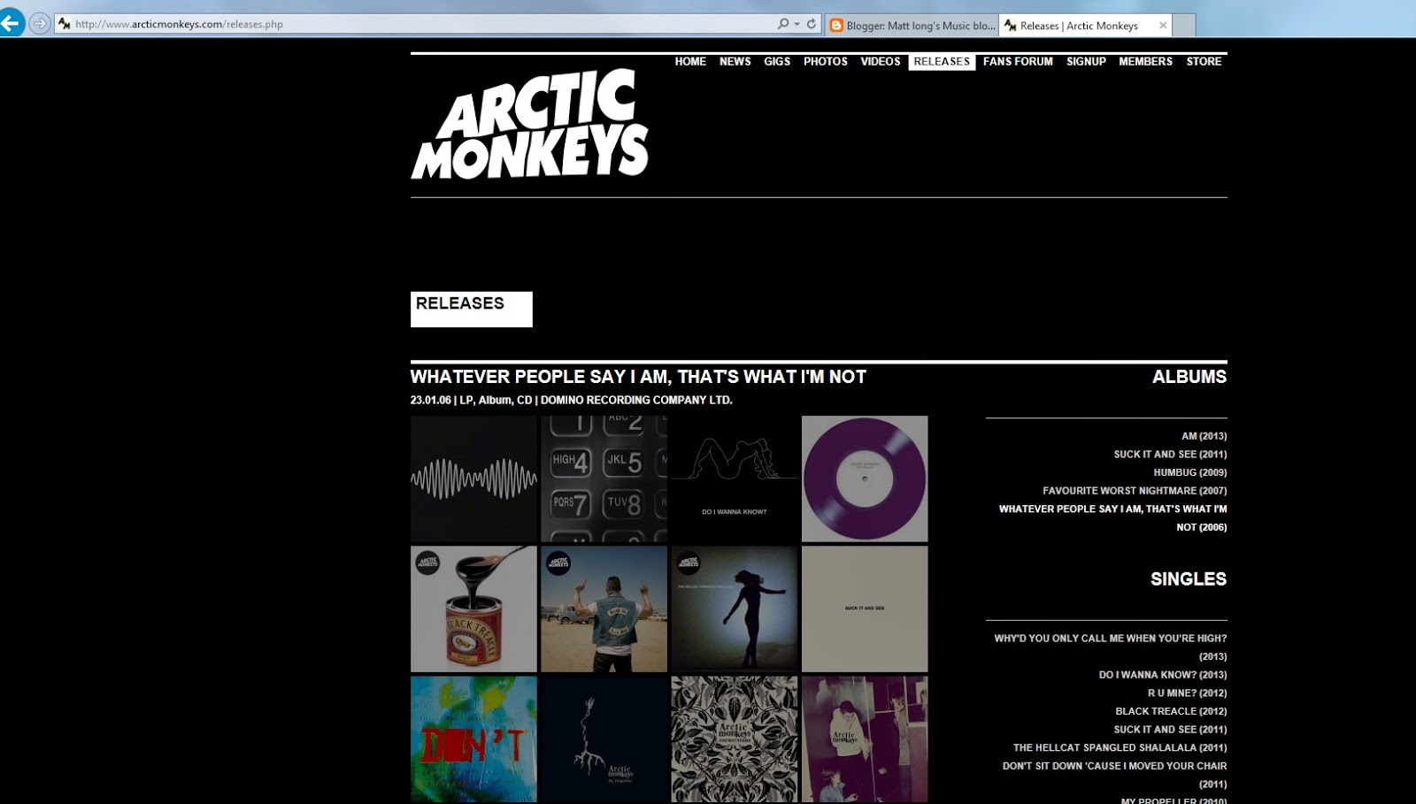
The Arctic Monkeys' website is much like that of the Strokes. The background is black, matching the colour of the last album 'AM', but the logo is associated with past albums. The home page also includes the latest new, a promotional video, the option to buy the most recent album in CD, Vinyl or digital form. There is also a link to the band's facebook page.
There is a quick and easy navigation bar, that leads you to various other pages of the website. The news page is updated a few times every few months, yet this is down to the band not releasing an album recently, and not having any gigs at present. Fans can comment on the news, yet they have to sign up to be able to. Fans can also share the news, and look through an archive of previous news. The gigs page is fairly sparse, as the band have no upcoming gigs. However, fans can look back at previous gigs, and look through photos and videos from those gigs. Yet, there is both a photo and video page, where fans can look back a past images and gigs. There is also a 'Releases' page, where all the band's albums and most popular singles are available to look back at, yet not listen to.
One of the navigation bars leads to a fans forum, where fans are debating and discussing their favourite songs and albums by the band. Again, you have to become a member as to comment on this, and to get exclusive content; there is a quick and easy navigation bar that leads you to a page where fans can sign up. This then leads to a members page. The fans store is much like Mallory Knox's store. Fans can purchase a wide variety of merchandise, including t-shirts and jumpers to albums and singles.

Tuesday, 10 March 2015

Website analysis - Mallory Knox

The Mallory Knox website is fairly basic, in comparison to that of the Strokes website. The website itself, features only one page in which contains all the necessary information. However, this is not typical of an artist's/band's website. But as the band are more heavy metal than the Strokes, they may feel they have to be more restrictive with the information, to match the genre. The background to the website is the colours of the new album - a darkish, blackish blue.  The band's name is not mention, instead the logo sits at the top of the page. This gives the sense that the website is more for the fans, not people researching about the band. The website promotes the new album, with the subheading reading 'The New Album Asymmetry Out Now'. There is then the option to buy the album, below this, on Amazon, iTunes and the Official Store.
The band's page also has a YouTube playlist, with music videos from their most popular songs, chats between the band members and their visit to the Radio 1 Live Lounge. There is also a link to tickets for their upcoming gigs, available on songkick. Moreover, there are links to the band's facebook, twitter, instagram, YouTube and spotify pages. There is also a special membership login, that if a fan signs up, they can get exclusive content; something a little more unique compared to other bands.  

There is a quick and easy link to the merchandise that includes a wider variety of clothing than that of the Strokes' store.
 

The website also has links to their YouTube and facebook pages, with a quick 'About' section that doesn't go into much detail. 

Website analysis - The Strokes

The Strokes' website features all the normal conventions of an artist's/band's website. The background is the new album cover for their latest album, where at the side it features a link to purchase the album, both in CD and digital form. The home screen also features all the latest news, in written form and in advert form, where the news swipes across the screen. Tickets for the most recent upcoming gig are also available to buy from the home page. There are also links to facebook, twitter, YouTube and VEVO, for any fans wanting more news. There is an easy to use navigation bar at the top of the screen with simplistic heading, so the audience don't struggle to find information.

The news page features present and previous news about the band. It is updated a few times a month by their website team, not the band personally. The language used is informal, typical of the genre as the band appear more personal to the fans, rather than reserved. Again, the option to buy the album is at the side of the page.

The events page, features all the confirmed, upcoming gigs the band are performing at. At the top, the most recent upcoming gig is secluded from the list under the heading 'Next Show' to distinguish that this is their next venue. There is a direct link to buy tickets that takes you straight to 'ticketmaster'. The option to buy the album, is again, prominent on this page.
 There are Music and Media pages that have downloadable content for the fans. The music page has all the band's albums (past and present), whilst have to option to buy or download a single. You can also play the songs on the band's website simply just by clicking on them. The band's most recent album takes centre stage at the top, as to attract fans to their new material. The media page features photos and videos of the band. Some of the photos are official photos, while others are photos of fans with the band, under the headline 'You and the band'. There are also videos from the most popular songs by the band, which the fans can comment on.

There is also a community page, where fans can: debate, converse or share information with each other.

The store takes you to a separate site, where only the Strokes' memorabilia is on sale. This features t-shirts, mainly for men, and jumpers.

Wednesday, 4 March 2015

Digipak sketches/Initial idea


Here is my initial idea for my front cover. It focuses on having the band walking towards the camera at a gritty setting, to help me to convey the genre at first glance. The font will change, having done some research, I have found some fonts I like that are similar to The Strokes' font. 

My image is similar to the back the 'Is this it' album by The Strokes. I liked this as it conveys the genre and helps me to convey band unity, also I believe it is a convention of an rock band to show themselves.


Website Conventions

Artist/band Website Conventions:


  • Easy navigation - mapped out so that it is easy to find material/information
  • Tabs and links to other pages or social media 
  • Social media links help the fans feel more in-touch with their artists - updates on Facebook or Twitter interest fans
  • Font and background that matches the theme of the website
  • Images for visual interest - related to the theme
  • Multi-media
  • Merchandise
  • Music videos
  • Asses to purchase CD or download songs online
  • Biography of band
  • Colour matches genre - bright = pop, dark = rock/alternative
  • Tour dates - where? when? how much?
  • Fan chat forum 
  • Competitions - keep fans entertained
  • News - updated often to keep the fans informed
  • Band name displayed clearly
  • Latest album details
  • Website matches the image of artist/band - e.g. a rapper's website would tend to be slick and stylish
I shall research more throughly, the conventions of a website by assessing several rock band's websites to see if there is anything I can learn for my website.

Monday, 2 March 2015

Font

My inspiration for my final font choice has come from several different rock bands, past and present. First of all, The Strokes, whose song we are preforming, have really good font that depicts the genre easily. I feel the colours work well together, as it enables the band's name to stand out. The font itself, has connotations of a retro, indie band; this is something I wouldn't mind emulating.
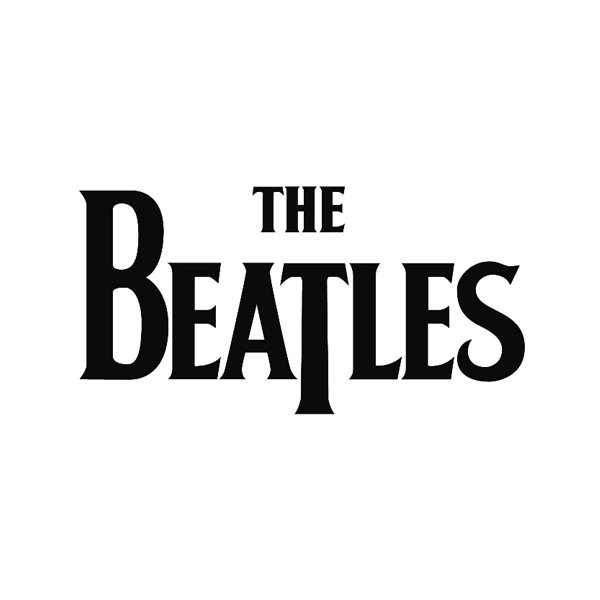
The Beatles' font is also inspirational. It is all in caps, which makes it stand out and also helps to convey the genre. The use of colour also contributes to the effect of the font. The traditional black and white, allows for the text to stand out. There is also a clear retro feel to this font.
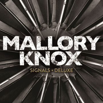
Mallory Knox's font conveys a different sort of rock. The band are more heavy metal compared to The Strokes or The Beatles, thus this has had an effect on their font. I like the way that their are cracks in the font, which helps to distinguish the genre. The colours are dark, contrasting that of pop, also conveying the genre. The caps help the text to stand out, and is something I am interested in.
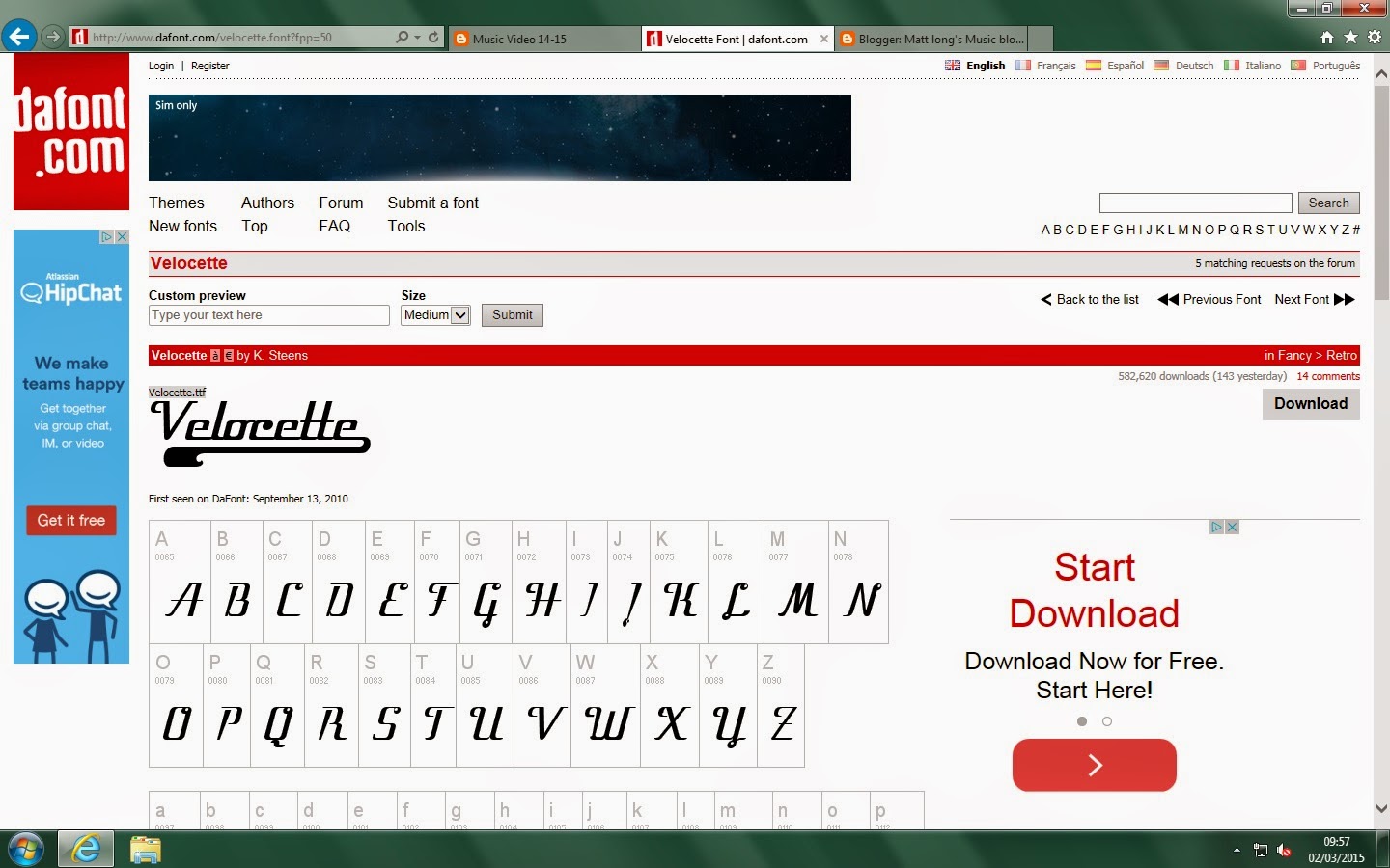
I looked on DaFont and found these three fonts that I liked.

 The first is more of a garage look, whilst the other two are more of a retro style. Texts one and two are not in caps, unlike the top one. I think I would like to keep searching for one that combines the two.


Digipak Template

This is the template I shall be using to create my Digipak. It is a standard 4-panel Digipak, which consists of a front, back and two middle panels. I will now work on trying to find the right images that will suit my Digipak. Me and my group will have to do a photo shoot for our Digipaks, and I will have to research font for my Digipak. I plan to have an image of the band on the front, accompanied by the band's name and album title. In the middle, I plan to have further images of the band, or images related to the band. On the back, I shall produce a track list and create a record label, using Photoshop. The band's name and album title will be repeated down the spine, with credits on the back. On the disc itself, I plan for the band's name to dominate the disc. The colour will probably be dark, and the copyright details will feature around the edge.

Sunday, 1 March 2015

Possible album photos


Here are some possible shots, from Brighton, for my Digipak. They will need some work, e.g. cropping and zooming in, but that can be done. We also plan to do a photo shoot as so to give us more options for photos and to create a greater sense of persona. I think the third picture down, is one that is good enough for my Digipak. The image helps convey the genre, as if it were pop, the band would be likely to be smiling at the camera at a bright location. Whilst this image captures the grittiness of garage rock.


Digipak Inspiration - Royal Blood 'Royal Blood'


Front
This album cover is different to all the others I have researched. The band use album art, which in black and white helps convey the genre as rock, as it is not bright like a pop album. The band's name is displayed in a font that matches the artwork. The white background is affective, as it makes the artwork and ban name stand out.


Back:
The back is similar to the front. The font matches the front, and again helps to portray the genre as rock. The band's name is repeated down the spine, yet this is a self-titled album, so the b and's name is the album title. The credits and record labels are also displayed at the bottom.


CD:
The CD disc matches the rock theme that is displayed throughout the album. The font matches the rest of the album, and the artwork is a feature on the CD, unlike the back. The copyrights, credits and record labels are all displayed on the disc.

Digipak Inspiration - Mallory Know 'Asymmetry'

Front:
The front of this album is cleaver. The band's initials 'MK' have been aligned as so they have become asymmetrical, linking to the title of the album. The black background enables the band's name and album title to stand out. This can represent the band's heavy rock style, that stands out for being loud and electrifying.


Back:
Fairly simple back cover, however it does have the same colour continuation as the front. The same font is used, which with it all in capital letters, again conveys the need to stand out and be bold. There are some conventions of albums present, including the barcode and record labels.


CD:
The CD disc (top left) again follows the colour codes of the front and back. The blue around the disk ring is affective and adds to the dimensions of the disc. The band's name and album title are placed at the top, in the same font. The copyrights and record labels are also displayed.

Thursday, 26 February 2015

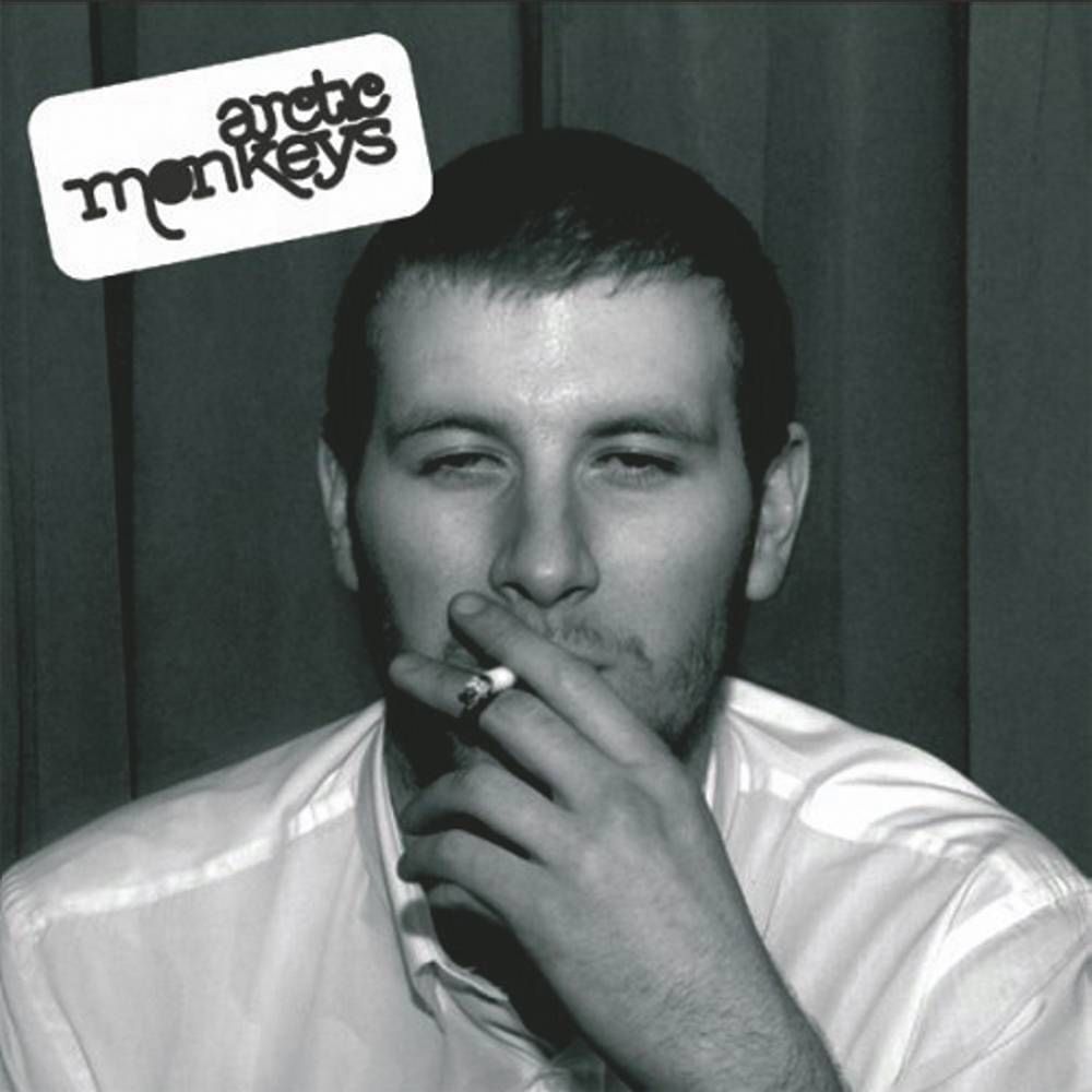
Digipak inspiration - Arctic Monkeys 'Whatever people say I am, that's what I am not'

Front:

This is the front cover of the album. The image draws attention straightaway, as it is interesting and perhaps a little controversial. It is definitely unconventional of front covers. Yet, this is most certainly the point. The band want to convey their edgy, controversial image. The band's name is displayed in the top,left-hand corner. It stands out against the metallic background, but also conveys genre. The indie/garage rock feel is portrayed through the font, that is unique and creative. However, the album title is not displayed. This again, signifies the importance of the image, as the band hope that alone will make this album recognisable, therefore doing the work of a title.


Back:
The image follows on from the front, yet looks depressing. However, it is to help the album become recognisable. Again, the same font as from the front is used for the tracklist. The barcode, record label and credits are displayed, as well as the album title which is displayed on the spine, in a different, more formal font. This possibly conveys the other side of the band's controversial persona; they are also professional.


CD:
This CD artwork is again unconventional, but relates to the images on both the front and back of the digipak. The band's record label is displayed, as well as the Copyright statement and credits. This disc is meant to stand out, and the image definitely does that, by being controversial and bold. This helps for the audience to understand the band's persona, without seeing a picture of them.


Digipak Inspiration - The Strokes 'Is This It'

The Strokes' album 'Is This It', released in 2001, is the album our chosen song 'Someday" originated from. I will assess their digipak, and look for certain conventions of our genre, that will help me create a successful digipak.

Front:
This is the front cover to the CD. The band's name stands out on the white background; to grad attention. This is also the effect of the album title. The image stands out, and the band use voyeurism to attract the male audience, whom are their primary target. The album's title can also represent the album title. The image doesn't offer the audience too much information about the band, and 'Is This It' could be the audiences response, as they want to see more of the band's image. Yet, the image could reflect their laddish values, conveying the way they view women.


Back:

This is more convention of a rock band, in comparison with the front cover. There is a clear image of the band, which conveys their laid back persona. The image is interesting, and making it black and white, allows it to stand out and give the band an indie feel. There is a barcode, credits, website links and a tracklist that are all conventions of CD digipaks. The band's name and album title are repeated on the spine.


CD:
This is the CD disc. The band's name dominates the disk, making it stand out. The font helps to give a sense of genre, indie/garage rock, as it is bold and striking. The use of the disc's middle as an 'O' is cleaver and recognisable. The blue stands out on the black, helping this disc become easily recognisable. There is a slick and stylish feel to this, as the band are trying to give hints to there persona.

Digipak Conventions

Digipak Conventions:

Digipaks can be associated with CDs and DVDs, as they help to promote the product. In terms of CDs, they help to promote the artist or band, and should try to have a recognisable font and album art to distinguish themselves from their competitors.

Here are some conventions:

Front:

  • Artist name
  • Album title
  • Image of the artist/band or perhaps a band logo
Back:

  • Artist name
  • Album title
  • Tracklist
  • Production credits
  • Barcode
  • Record label
  • Record label website
  • Image of artist or Colours/image connected to the artist/band
Spine:
  • Artist name
  • Album title
  • Distribution number
  • Record label
Booklet: (Front)
  • Iconic image - distinctive of the artist/band
  • Credits
Booklet contents:
  • Images of artist/band or related images to genre
  • Full lyric sheet
  • Track by track credits
  • Full credits
CD:
  • Image of artist/band
  • Artist name
  • Album title
  • Record label
  • Credits and Copyright
  • Compact Disk trademark

Friday, 13 February 2015

Mid-Production Audience Feedback


From our feedback, I can see there is a lot we need to work on. Although, many said they would love to watch it again, they pointed out the absence of the narrative sequence. I can see this had deeply damaged our score, as our classmates have stated that without the narrative, the music video fails to make too much sense. This would make it seem like more of a music video. I feel that from our feedback we need a faster pace of editing, as at the moment it is too slow and boring.

Friday, 6 February 2015

Album covers

For the genre we intend to do, there is a certain kind of album art we need to look at. The genre we have chosen is rock and we intend to follow other rock bands in the way they style their album covers.

Here are some old and new rock album covers:


The Beatles: "Sergeant Pepper's Lonely Hearts Club Band" (1967)
The Beatles were one of the first influential rock bands. This album design was typical at the time for more pop based artists, however The Beatles rivalled this with their 1967 album. We are unlikely to follow or copy what they did as it no longer fits the codes and conventions of a modern day rock band, but it just conveys how The Beatles challenged conventions of their era. Bright, colourful images on the front differ from the dark, colourless rock albums of the time. The album contained posters, booklets and lyrics. These were seen as the features that would bring about fans buying this album.


The Clash: "The Clash" (1977)
We are thinking of doing a Clash song and this album cover is one that we represent our final album cover. It shows the whole band, of which we would like to do and it is bold, suggesting a statement of the band's punk rock image. This is more typical of a rock band's album cover, though today, it is a little bit out-dated. The album contained posters, booklets and lyrics, which would help entice people to buy their album. The artists are being branded as punk rock artists, and the album cover definitely conveys this. We may try and copy this album art, yet possible update it as it is now quite outdated.


Oasis: "(What's The Story) Morning Glory?" (1995)
This album is iconic, not just because of the songs, but the album cover itself. It is so basic that it works well to compliment the band's image. This basic form of album cover may inspire us to copy them. People remember this album because of its uniqueness - we will hope to imitate this. The re-release of this album came with the chance for each buyer to install an image of themselves on the front of their album. This increased sales for the re-release, as it made the album much more personal for the buyer and Oasis fans.


Nine Inch Nails: "Year Zero" (2007)
This album is known for its unique release, though the album cover is slightly unusual and draws attention. We won't try and do something like this with our album, as we want to make it clear of our genre, through our album cover. The only reason people now the genre is rock from this album, is due to the name, people recognise "Nine Inch Nails" and know that the genre is rock. The reason why this album's release was unique was as the release date for the album drew closer, lead singer Trent Reznor, teamed-up with game creators 42 Entertainment, and mage an online video game. The game was based around the fourth-coming album and received so much support it was going to be turned into a TV drama; this has since stalled. 


U2: "Songs of Innocence" (2014)
This album gained worldwide publicity for the wrong reasons. U2's big new album was released to the public for free on iTunes, following a deal with Apple. The album was received by the millions of iTunes users, and was automatically downloaded onto their accounts. Many were out roared as they saw this as a violation of their privacy, and U2 were forced to apologise. Bono, the lead singer, thought that this was what the people wanted, and was trying to give them something in return for their support. However, it was not successful and did not gain them the public support they wanted. 


Monday, 26 January 2015

Assessment of Guitarist performances

As I am a guitarist in our music video, I will research professional performances as to create a more believable performance.


Audience Feedback

From our audience feedback, I found a number of different answers that will help develop our music video in terms of narrative and performance.

I found that our audience research produced results that insisted on us using constant close-ups of the band playing and of their faces. This is to get a stronger connection between us and our audience. They also us to be energetic with our performance, which is a convention of rock music videos. This performance may be laddish, so we will aim to convey this in our narrative side of our music video. They also saw that our band should be seen playing frequently, as they saw the narrative as the main source of entertainment and for us to connect with our audience. However, it is a convention for a band to playing during a rock song, as it allows the band to express themselves through music. 

For the narrative, they suggested that it should be laddish, yet also serious. This will help make the narrative interesting and enable us to create an energetic performance. They also want our visuals to match the lyrics, as for their to be a greater connection to the band's meaning. Although, they expected something more serious as to convey meaning, they did want some light-hearted moments to create entertainment.