Showing posts with label Digipak. Show all posts

Thursday, 26 March 2015

Final Digipak

This is my final Digipak:

 Front Cover:
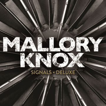
My front cover is based on the conventions of rock band album covers, where the image is either representative of the band or of the content on the album. I took inspiration form Mallory Knox's 'Asymmetry', where the image on the front is asymmetrical and has a direct link to the album. In my case the wheel represents youth, in the sense it is like a fairground wheel. Yet, it also is related to the content of the Someday music video.

Mallory Knox 'Asymmetry' Front Cover:


Back Cover:

My back cover took inspiration from The Strokes' back cover to 'Is This It'. It is conventional to have an image of the band in a rock Digipak, and typically this either occurs inside or on the back of the album. I saw that if someone was to pick up my album in a store, the first two things they look at are the front and back covers. Thus, having an image of the band is necessary when the front is album art, as the fans get an image of their role models. I liked The Strokes' back cover as it summed up the band's image - cool and stylish, and this is what I thought this image did for us.

The Strokes 'Is This It' Back Cover:
Lyrics page:
I based my lyrics page on the Arctic Monkeys' lyrics page in their album 'Humbug'. They used an image of the band accompanied by the lyrics, and I saw this as effective as I could relate my image to the song. I used the image of us throwing stones into the sea as a symbol of youth, thus having a direct link to lyrics for Someday and the themes of the past and growing up.

The Arctic Monkeys 'Humbug' lyrics page:
Inside cover:
For this I just followed the colour scheme of my previous covers and used an image of the band, as to make it more personal for our fans.
CD:
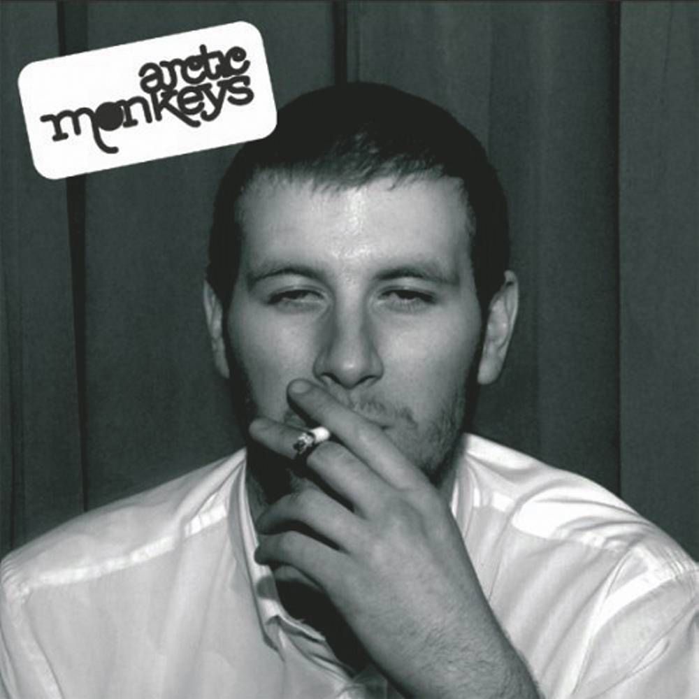
For my CD disc I took inspiration from the Arctic Monkeys' 'Whatever People Say I am, That's What I am Not'. The disc from this album is related to the front cover of the album. I did the same with mine. My disc is related to my album cover, in the sense that it is related to the content of the Someday music video and again is a symbol of youth. The colours remain the same as all my other covers, and the logo, album and the record label are conventions for a CD disk.


The image of the man smoking on the front, is referenced again on the CD as conveyed by the image of cigerettes.


Digipak update 4

I have made a lyrics page for my Digipak. I have used the same sepia and red tint look that features throughout my Digipak. A lyrics page is a necessity for albums, and is a common feature in rock albums, such as The Arctic Monkeys 'Humbug' lyric page.
I took inspiration from this and used an image of the band to accompany the lyrics page:
I also finished the last page of my Digipak that follows all the conventions of my other pages, including the sepia layer and red tint.

Digipak update 3

I have completed my back cover, and it looks like this:
I have chosen colour that match both my website and our music video. Their is a sepia look that features in our super-8 look in our music video. Also, there is a red layer over the top of the image, which matches my website. I have used the same font colour and style as the front cover, as for continuity. The barcode, record label and Copyright details are all conventions for all album back covers. My inspiration for the image came from the Strokes' album 'Is This It' where the back cover is a picture of the band walking towards the camera.
 Their back cover is in black and white, which helps reference the genre. However, I see that my choice of colour references the: genre, music video and band's logo.

Tuesday, 24 March 2015

Digipak update 2

This is my front cover thus far:

The band's logo is a convention for all rock album covers, so it sits in the top right-hand corner as not to block the view of the image. I have put a red layer over the top, but have just lowered the opacity. The red layer was the red I used for the background of the logo and on my website. I have used the white text and same font as the logo, as so the font can become easily recognisable and for continuation. The 'Parental Advisory' logo is common on most albums, where there is explicit references in songs. 

Digipak update 1

I have chosen my front cover image. Normally, rock bands tend to either have an album cover where their logo is simply enough to sell the album, such as The Arctic Monkeys' album 'Suck it and See'.
This won't work for us, as they were an established band when this album came out, so their recognisable logo and style was enough to market the album. However, some rock bands use images related to the band or images related to one of their songs on the album, as their album cover. Some prime examples of this are: Mallory Knox's 'Asymmetry' album has the band's logo lined up asymmetrically on the front cover, thus linking to the album title.

This is the approach I am going for. So I have chosen this image for my front cover:
 
The wheel represents youth and is referenced in our music video as past memory. This means that my front cover is interlinked with the music video, but also stays true to the conventions of rock band album covers by having an image either linked to the band or the album; in my case it references the album.


Wednesday, 4 March 2015

Digipak sketches/Initial idea


Here is my initial idea for my front cover. It focuses on having the band walking towards the camera at a gritty setting, to help me to convey the genre at first glance. The font will change, having done some research, I have found some fonts I like that are similar to The Strokes' font. 

My image is similar to the back the 'Is this it' album by The Strokes. I liked this as it conveys the genre and helps me to convey band unity, also I believe it is a convention of an rock band to show themselves.


Monday, 2 March 2015

Font

My inspiration for my final font choice has come from several different rock bands, past and present. First of all, The Strokes, whose song we are preforming, have really good font that depicts the genre easily. I feel the colours work well together, as it enables the band's name to stand out. The font itself, has connotations of a retro, indie band; this is something I wouldn't mind emulating.
The Beatles' font is also inspirational. It is all in caps, which makes it stand out and also helps to convey the genre. The use of colour also contributes to the effect of the font. The traditional black and white, allows for the text to stand out. There is also a clear retro feel to this font.
Mallory Knox's font conveys a different sort of rock. The band are more heavy metal compared to The Strokes or The Beatles, thus this has had an effect on their font. I like the way that their are cracks in the font, which helps to distinguish the genre. The colours are dark, contrasting that of pop, also conveying the genre. The caps help the text to stand out, and is something I am interested in.
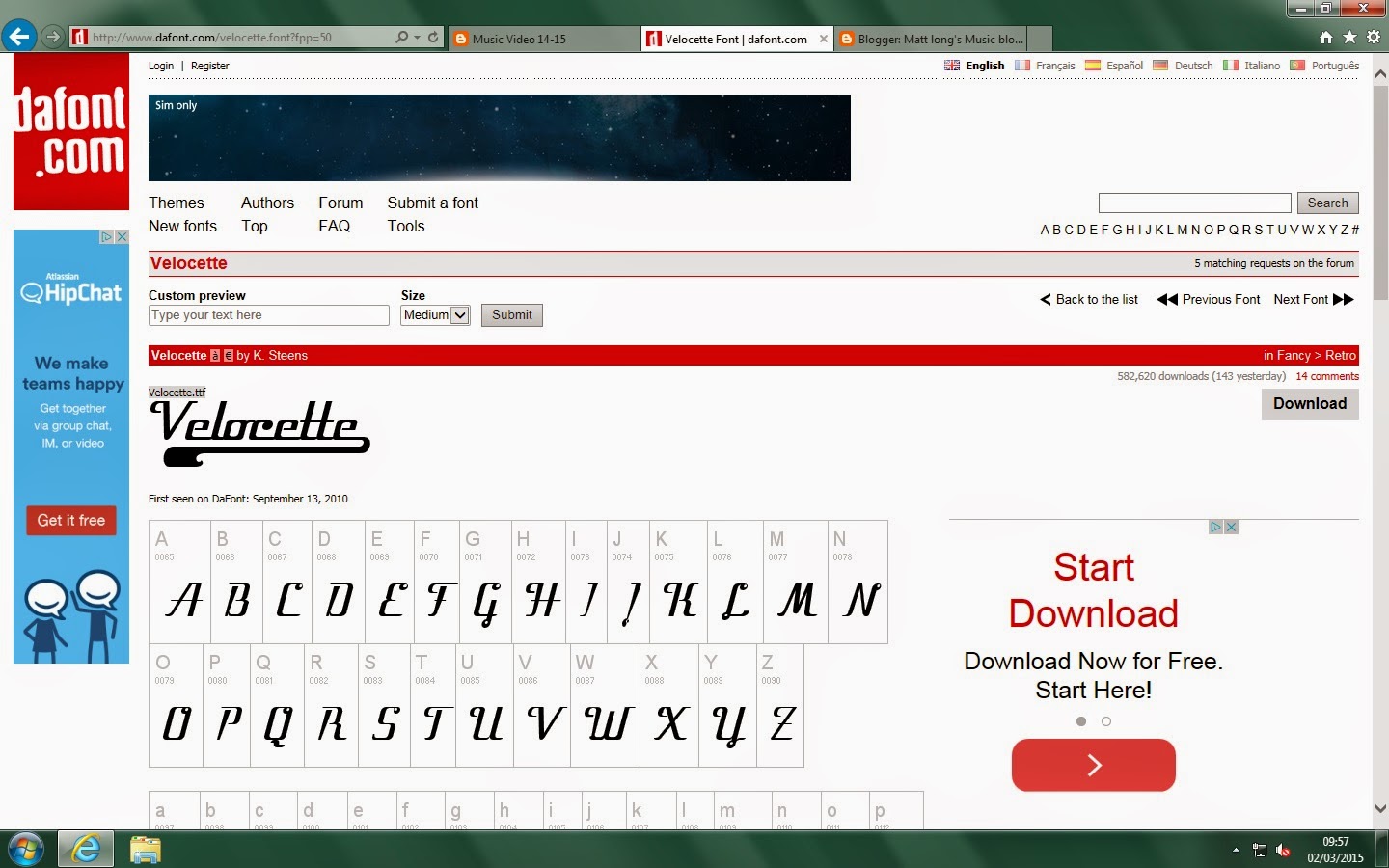
I looked on DaFont and found these three fonts that I liked.

 The first is more of a garage look, whilst the other two are more of a retro style. Texts one and two are not in caps, unlike the top one. I think I would like to keep searching for one that combines the two.


Digipak Template

This is the template I shall be using to create my Digipak. It is a standard 4-panel Digipak, which consists of a front, back and two middle panels. I will now work on trying to find the right images that will suit my Digipak. Me and my group will have to do a photo shoot for our Digipaks, and I will have to research font for my Digipak. I plan to have an image of the band on the front, accompanied by the band's name and album title. In the middle, I plan to have further images of the band, or images related to the band. On the back, I shall produce a track list and create a record label, using Photoshop. The band's name and album title will be repeated down the spine, with credits on the back. On the disc itself, I plan for the band's name to dominate the disc. The colour will probably be dark, and the copyright details will feature around the edge.

Sunday, 1 March 2015

Possible album photos


Here are some possible shots, from Brighton, for my Digipak. They will need some work, e.g. cropping and zooming in, but that can be done. We also plan to do a photo shoot as so to give us more options for photos and to create a greater sense of persona. I think the third picture down, is one that is good enough for my Digipak. The image helps convey the genre, as if it were pop, the band would be likely to be smiling at the camera at a bright location. Whilst this image captures the grittiness of garage rock.


Digipak Inspiration - Royal Blood 'Royal Blood'


Front
This album cover is different to all the others I have researched. The band use album art, which in black and white helps convey the genre as rock, as it is not bright like a pop album. The band's name is displayed in a font that matches the artwork. The white background is affective, as it makes the artwork and ban name stand out.


Back:
The back is similar to the front. The font matches the front, and again helps to portray the genre as rock. The band's name is repeated down the spine, yet this is a self-titled album, so the b and's name is the album title. The credits and record labels are also displayed at the bottom.


CD:
The CD disc matches the rock theme that is displayed throughout the album. The font matches the rest of the album, and the artwork is a feature on the CD, unlike the back. The copyrights, credits and record labels are all displayed on the disc.

Digipak Inspiration - Mallory Know 'Asymmetry'

Front:
The front of this album is cleaver. The band's initials 'MK' have been aligned as so they have become asymmetrical, linking to the title of the album. The black background enables the band's name and album title to stand out. This can represent the band's heavy rock style, that stands out for being loud and electrifying.


Back:
Fairly simple back cover, however it does have the same colour continuation as the front. The same font is used, which with it all in capital letters, again conveys the need to stand out and be bold. There are some conventions of albums present, including the barcode and record labels.


CD:
The CD disc (top left) again follows the colour codes of the front and back. The blue around the disk ring is affective and adds to the dimensions of the disc. The band's name and album title are placed at the top, in the same font. The copyrights and record labels are also displayed.

Thursday, 26 February 2015

Digipak inspiration - Arctic Monkeys 'Whatever people say I am, that's what I am not'

Front:

This is the front cover of the album. The image draws attention straightaway, as it is interesting and perhaps a little controversial. It is definitely unconventional of front covers. Yet, this is most certainly the point. The band want to convey their edgy, controversial image. The band's name is displayed in the top,left-hand corner. It stands out against the metallic background, but also conveys genre. The indie/garage rock feel is portrayed through the font, that is unique and creative. However, the album title is not displayed. This again, signifies the importance of the image, as the band hope that alone will make this album recognisable, therefore doing the work of a title.


Back:
The image follows on from the front, yet looks depressing. However, it is to help the album become recognisable. Again, the same font as from the front is used for the tracklist. The barcode, record label and credits are displayed, as well as the album title which is displayed on the spine, in a different, more formal font. This possibly conveys the other side of the band's controversial persona; they are also professional.


CD:
This CD artwork is again unconventional, but relates to the images on both the front and back of the digipak. The band's record label is displayed, as well as the Copyright statement and credits. This disc is meant to stand out, and the image definitely does that, by being controversial and bold. This helps for the audience to understand the band's persona, without seeing a picture of them.


Digipak Inspiration - The Strokes 'Is This It'

The Strokes' album 'Is This It', released in 2001, is the album our chosen song 'Someday" originated from. I will assess their digipak, and look for certain conventions of our genre, that will help me create a successful digipak.

Front:
This is the front cover to the CD. The band's name stands out on the white background; to grad attention. This is also the effect of the album title. The image stands out, and the band use voyeurism to attract the male audience, whom are their primary target. The album's title can also represent the album title. The image doesn't offer the audience too much information about the band, and 'Is This It' could be the audiences response, as they want to see more of the band's image. Yet, the image could reflect their laddish values, conveying the way they view women.


Back:

This is more convention of a rock band, in comparison with the front cover. There is a clear image of the band, which conveys their laid back persona. The image is interesting, and making it black and white, allows it to stand out and give the band an indie feel. There is a barcode, credits, website links and a tracklist that are all conventions of CD digipaks. The band's name and album title are repeated on the spine.


CD:
This is the CD disc. The band's name dominates the disk, making it stand out. The font helps to give a sense of genre, indie/garage rock, as it is bold and striking. The use of the disc's middle as an 'O' is cleaver and recognisable. The blue stands out on the black, helping this disc become easily recognisable. There is a slick and stylish feel to this, as the band are trying to give hints to there persona.

Digipak Conventions

Digipak Conventions:

Digipaks can be associated with CDs and DVDs, as they help to promote the product. In terms of CDs, they help to promote the artist or band, and should try to have a recognisable font and album art to distinguish themselves from their competitors.

Here are some conventions:

Front:

  • Artist name
  • Album title
  • Image of the artist/band or perhaps a band logo
Back:

  • Artist name
  • Album title
  • Tracklist
  • Production credits
  • Barcode
  • Record label
  • Record label website
  • Image of artist or Colours/image connected to the artist/band
Spine:
  • Artist name
  • Album title
  • Distribution number
  • Record label
Booklet: (Front)
  • Iconic image - distinctive of the artist/band
  • Credits
Booklet contents:
  • Images of artist/band or related images to genre
  • Full lyric sheet
  • Track by track credits
  • Full credits
CD:
  • Image of artist/band
  • Artist name
  • Album title
  • Record label
  • Credits and Copyright
  • Compact Disk trademark

Friday, 6 February 2015

Album covers

For the genre we intend to do, there is a certain kind of album art we need to look at. The genre we have chosen is rock and we intend to follow other rock bands in the way they style their album covers.

Here are some old and new rock album covers:


The Beatles: "Sergeant Pepper's Lonely Hearts Club Band" (1967)
The Beatles were one of the first influential rock bands. This album design was typical at the time for more pop based artists, however The Beatles rivalled this with their 1967 album. We are unlikely to follow or copy what they did as it no longer fits the codes and conventions of a modern day rock band, but it just conveys how The Beatles challenged conventions of their era. Bright, colourful images on the front differ from the dark, colourless rock albums of the time. The album contained posters, booklets and lyrics. These were seen as the features that would bring about fans buying this album.


The Clash: "The Clash" (1977)
We are thinking of doing a Clash song and this album cover is one that we represent our final album cover. It shows the whole band, of which we would like to do and it is bold, suggesting a statement of the band's punk rock image. This is more typical of a rock band's album cover, though today, it is a little bit out-dated. The album contained posters, booklets and lyrics, which would help entice people to buy their album. The artists are being branded as punk rock artists, and the album cover definitely conveys this. We may try and copy this album art, yet possible update it as it is now quite outdated.


Oasis: "(What's The Story) Morning Glory?" (1995)
This album is iconic, not just because of the songs, but the album cover itself. It is so basic that it works well to compliment the band's image. This basic form of album cover may inspire us to copy them. People remember this album because of its uniqueness - we will hope to imitate this. The re-release of this album came with the chance for each buyer to install an image of themselves on the front of their album. This increased sales for the re-release, as it made the album much more personal for the buyer and Oasis fans.


Nine Inch Nails: "Year Zero" (2007)
This album is known for its unique release, though the album cover is slightly unusual and draws attention. We won't try and do something like this with our album, as we want to make it clear of our genre, through our album cover. The only reason people now the genre is rock from this album, is due to the name, people recognise "Nine Inch Nails" and know that the genre is rock. The reason why this album's release was unique was as the release date for the album drew closer, lead singer Trent Reznor, teamed-up with game creators 42 Entertainment, and mage an online video game. The game was based around the fourth-coming album and received so much support it was going to be turned into a TV drama; this has since stalled. 


U2: "Songs of Innocence" (2014)
This album gained worldwide publicity for the wrong reasons. U2's big new album was released to the public for free on iTunes, following a deal with Apple. The album was received by the millions of iTunes users, and was automatically downloaded onto their accounts. Many were out roared as they saw this as a violation of their privacy, and U2 were forced to apologise. Bono, the lead singer, thought that this was what the people wanted, and was trying to give them something in return for their support. However, it was not successful and did not gain them the public support they wanted.